Graphic Design projects for Include.org – A charity that provides speech & language therapy-based community activities and training activities which include and support people with understanding and speaking difficulties.
My role: UX/Graphic Design volunteer
When working on projects with Include.org, it is my responsibility to utilise their graphic design assets and branding guidelines to create visuals that are informative, insightful and engaging to draw attention to certain campaigns they are running or to introduce the services they provide.
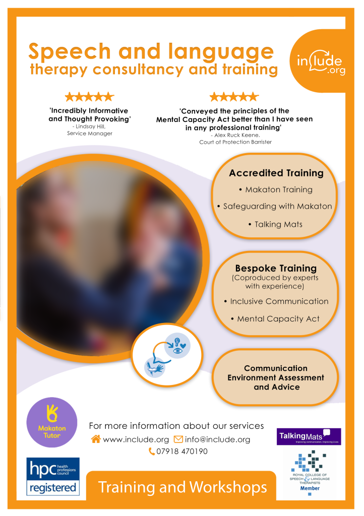
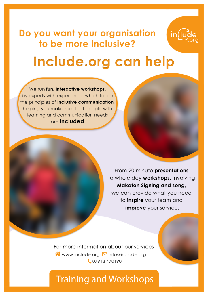
Training and Workshop flyers for print purposes for the Include.org charity. Images blurred for GDPR, but feature photographs of the community sessions and Makaton signing.
Fundraising Campaign Project Overview:
Volunteering as a Graphic Designer for the charity Include.org, who focus on breaking down the barriers for people with communication needs.
This project required a strong focus on accessibility, in order to be easily read and understood by people who have communication needs.
Who are Include?
Include.org improves the lives of people with and without understanding and / or speaking difficulties through creative community activities, consultancy and training. We work with people with learning disabilities, autism, dementia and other conditions with associated communication difficulties. We provide training for health, education and social care providers & businesses – and raise awareness of communication disability.
Brief
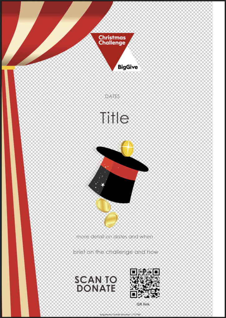
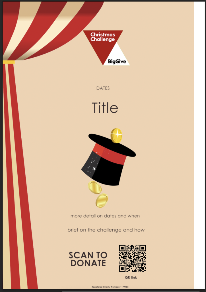
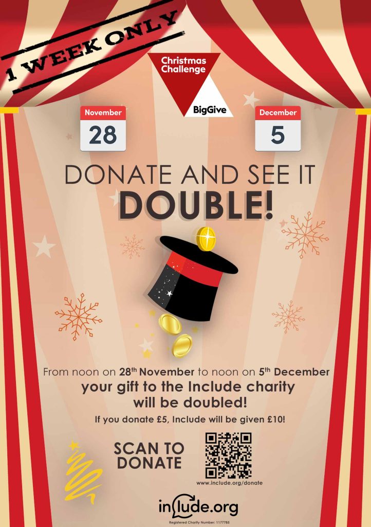
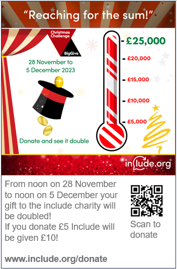
To create an eye-catching A5 handout/flyer for a fundraising challenge campaign that is ready for print with a short turnaround (1 week). Flyer should tell people about the Big Give Christmas Challenge (https://biggive.org/christmas-challenge/) and how to donate (including the QR code to their donation page).
The back of the flyer should contain some more information about where the fundraised money will go within the charity, some pictures or Makaton signs and symbols, and a positive message about empowerment.
Proposed theme: Circus/The Greatest Showman – to correlate with their use of The Greatest Showman song/phrase ‘This is Me’, teaching people to be proud of who they are.
Research:
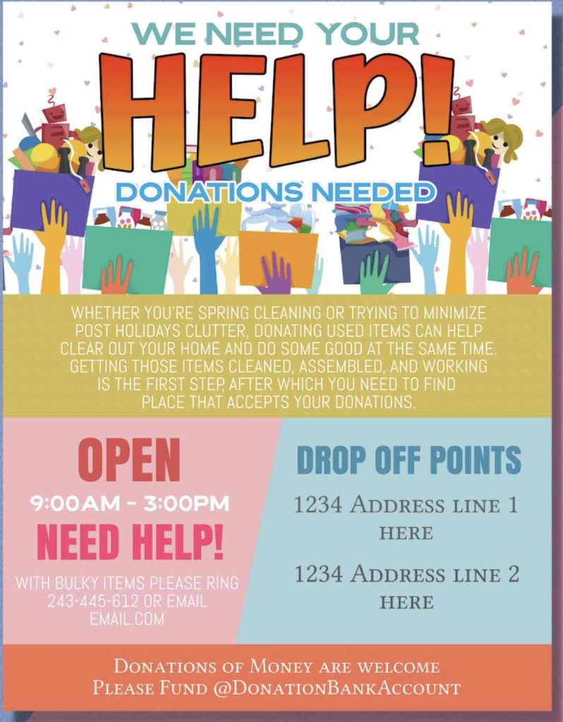
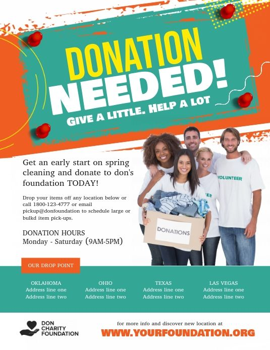
Understanding fundraising material, what general ideas tend to look like, finding examples and learning what recurring themes there are.
The main idea is to attract people to donating in just 1 week.
Circus/The Greatest Showman Theme Research:
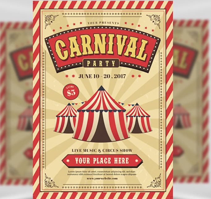
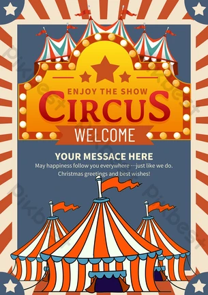
Discoveries from Research:
- Strong, bold title, eye-catching, ‘donating’ large making that the focal point
- Dates
- Logos
- Warm and welcoming graphics
- Not too busy, clear layout, clear message
- Red and white theme, beige background works well behind circus border, good colour to have black text on top of too
- Dark brown text instead of black for a softer/warmer feel
Basic Draft (Designed and provided already by the team) – as a starting point:
Advice and tips from the team throughout:
Alix:
I wonder if we could reduce the amount of text generally. I am not sure if we need that much on this flyer – or whether just having one line like ‘Help us give people with communication needs a choice and a voice’, the photos, and then This is Me in bold simple text with the Makaton signs or symbols above the text, and then the Donation QR code may be more impactful (and would still enable us to be sharing a message of inclusive communication).
If we do use the longer text – can we use the phrase ‘people of all ages’ rather than young people – just because this we are also looking at developing dementia work at the moment as well as the Trustee / supported employment side and I’m cautious of focusing on only one key area.
Penny:
One of the most important things for this A5 flyer is the timing – we need to print asap. So I’m afraid the creative freedom is a bit limited
I agree that the dates need to be bigger so people can easily read November and December.
I also agree we need the Include logo on the front. I would like to see “your gift to the Include charity” in the same size font as the line Will be doubled if possible please. Also then wonder if this is where the Include.org logo could go – kind of in the sentence?
I am in two minds about the next amend – we don’t say anywhere that we need to raise £25,000 but we have the line “Reaching for the Sum” – I think we need to say either both of these things together – or neither. Perhaps neither on the front?
My Design Drafts Process
Graphic elements provided already by the team, my job was to put it all together with effective typography, colours, shadows and all marketing assets for the campaign.