App for parents to check their child’s healthcare records
Project Overview
Design an app and a responsive website that enables parents to review their children’s health records, print the records to meet school or camp requirements, and see when their children’s healthcare visits are due.
Stage 1: User Research – Understanding, researching and analysing the users.
Results obtained from user surveys and user interviews
Survey Synthesis
From collecting this data, although the interviewees were limited and with more resources I would aim to reach a larger sample section, the identified patterns are:
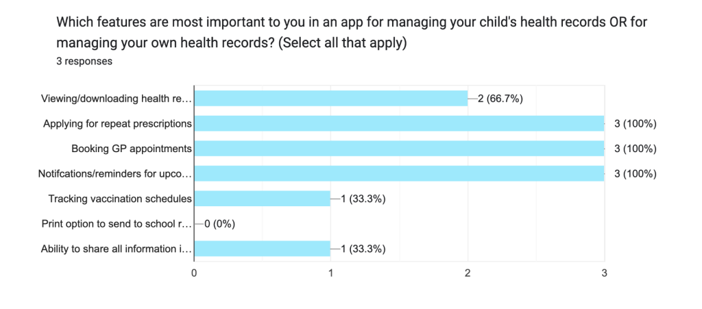
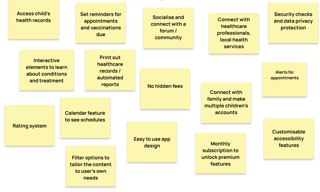
- Most users would benefit from an app that allowed the viewing/downloading of health records.
- All users would find an app helpful if it provided the following: Applying for repeat prescriptions, booking GP appointments, notifications/reminders for upcoming appointments.
Users want to use:
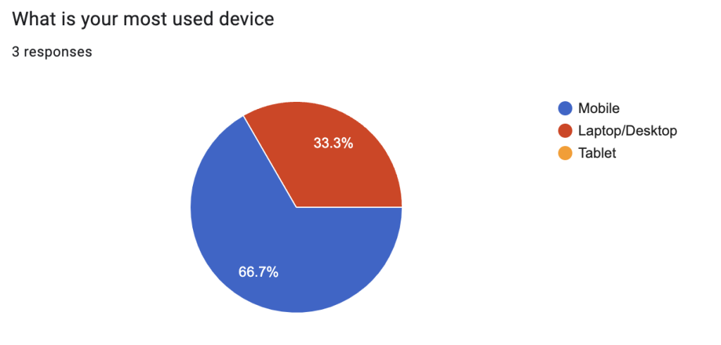
- Mobile phones to access their health records as electronic files
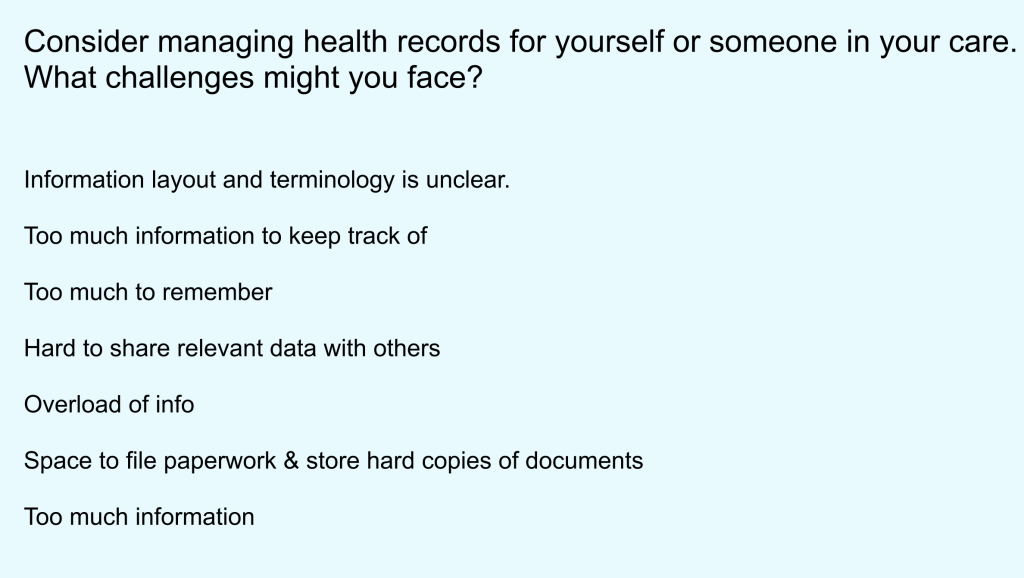
Users are put off by:
- An overload of information
- Not enough space to store documents
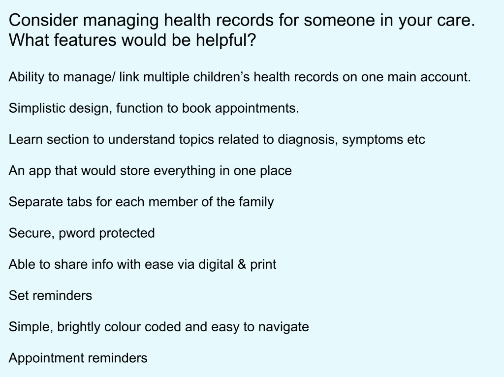
Users want to be able to:
- Link and manage multiple children’s health records on one main account
- Learn about health topics, diagnosis and symptoms
- Trust that their data is protected and secure, with a password feature
- Ability to share information with ease
- Set reminders for appointments
- Access a platform with simplistic design that is easy to navigate
User Personas and User Stories
_page-0001-min")
_page-0002")
_page-0003")
User Journey Mapping
These user journey maps demonstrate the actions, tasks, emotions and frustrations of 3 different personas, including opportunities for improvement and problem solving based upon the problems that arise.
Here are the goals of the 3 different users:
- Persona 1: Sarah wants to use an app that will help her learn about her baby’s medical conditions and treatments
- Persona 2: Alex wants to use an app with clear and concise information for multiple children’s health records and printable options
- Persona 3: Chris wants to use an app that has personalised reminders and a sensory-friendly interface to accommodate his autism.
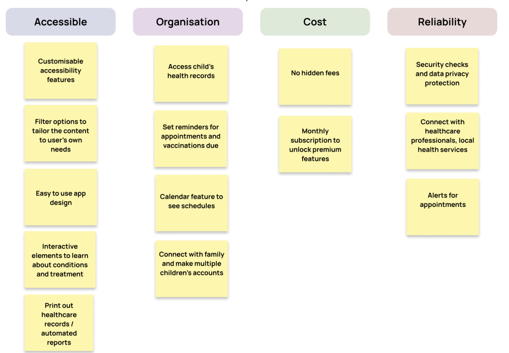
From these journeys, I can deviate some recurring key elements that will need to be addressed to maximise a user-friendly platform.
Users would benefit from a clear and intuitive onboarding process that includes reassurance of data privacy.
Users would benefit from clear guidance and navigation through the app features and the ability to tailor the information to your own requirements
Users would benefit from accessibility features
- Welcoming messages
- Option for a guided tutorial, with additional option of not needing a tutorial
- Privacy and Consent Clarity
- Personalised content recommendations
- Interactive elements and drop down lists to expand on relevant information
- A guided tour/tutorial to help understanding how to navigate through the app
- Content filtering and sorting to tailor to the user
- Visually organised with icons, symbols, colours
- Direct numbers for GP or Health services to correct information
- Visual icons and colours – Ensure imagery and icons are universally understandable and inclusive
- Text-to-speech feature – This benefits all users, especially those with eye-sight problems, difficulty typing. However, this could also really benefit Persona 2: Alex, who is a busy working parent who might need to be updating the app on the go.
- Voice commands
- Adjustable font sizes, light/dark mode
Value Propositions
Identifying Value Propositions and Making Goal Statements
Competitive Audit
Analysing the experience of 4 competitors:
- Best Beginnings / Baby Buddy
- NHS Healthier Together
- NHS Catch
- Medisafe Pill Minder and Trackers
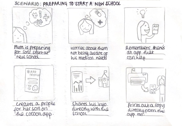
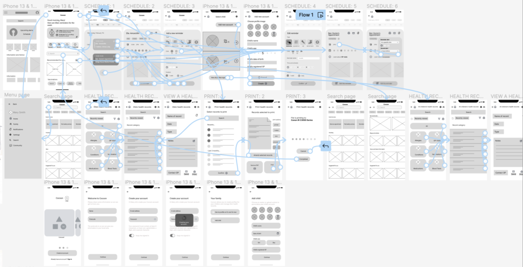
Userflows and Storyboarding
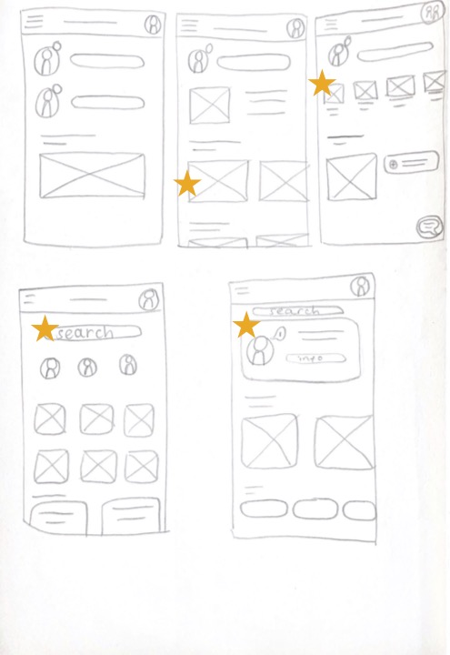
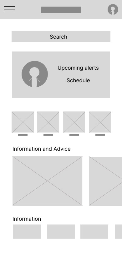
Low Fidelity to High Fidelity Wireframe process
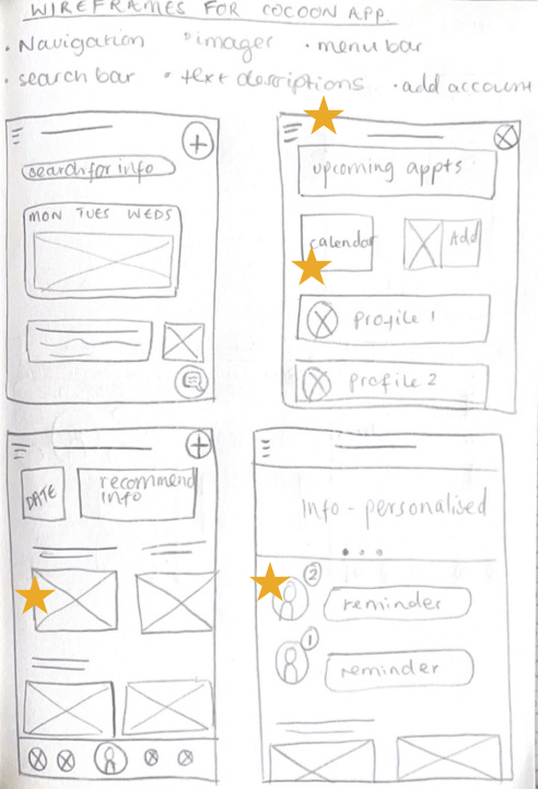
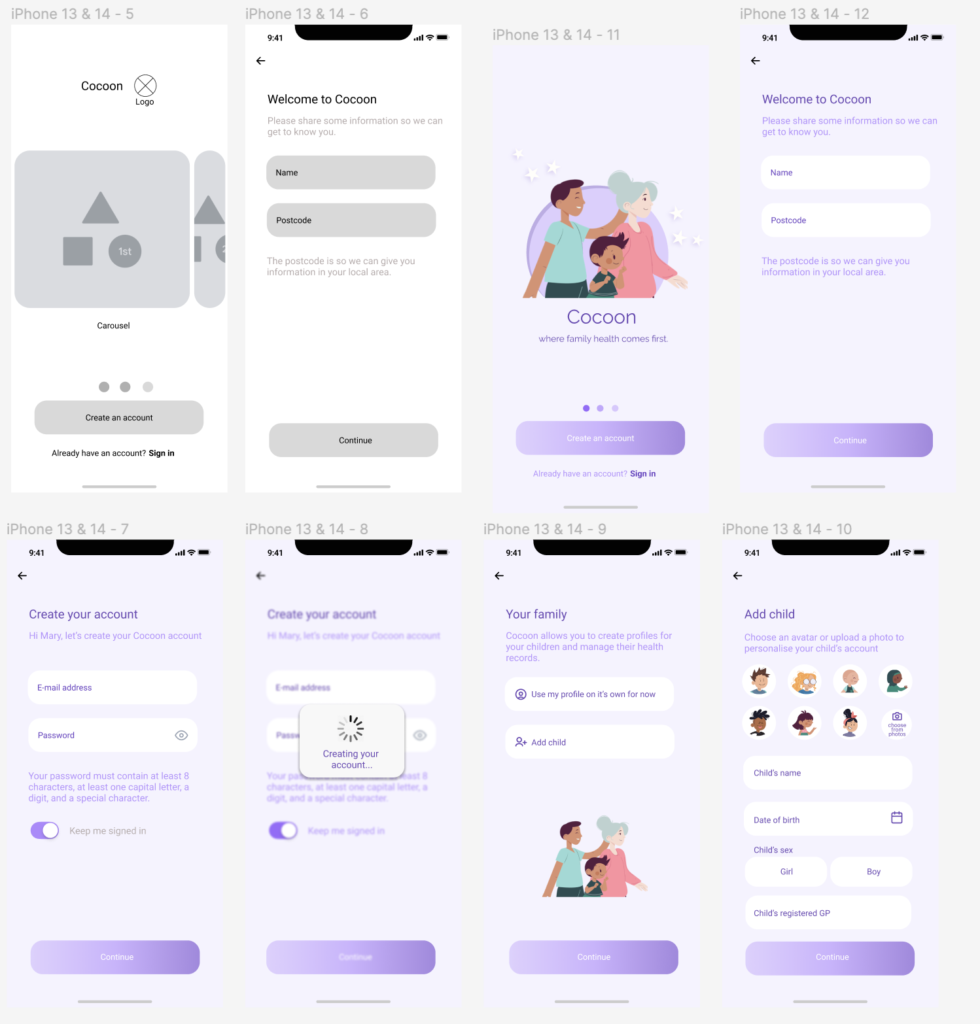
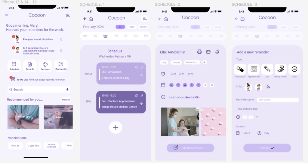
INTERACTIVE PROTOTYPES FOR USABILITY TESTING:
The low fidelity wireframing stage required frequent user testing at many points throughout the process. Here are some of the amendments made as a result of consistent usability testing:
- Easy flow of navigation – Sometimes users found it confusing how to return back to the homepage, or how to quickly switch between the different areas of the app without needing to go all the way back to the home page. I fixed this by implementing a side navigation bar that can pop out from any page you are on. This page can then direct you to different areas of the app.
- Processing/confirmation screen when printing – Some users found it quite abrupt how the ‘print’ function suddenly took them to the final printing stage, and are usually accustomed to being able to double check their files before printing. To resolve this issue, I added in multiple confirmation stages of print. The first stage allows you to select exactly what pages you wish to print, allowing you to select a variety or deselect any you no longer need. The next stage allows you to select your specific printing properties. Whether this is double-sided paper, black and white etc. This page also gives the option to send the PDF as an email. The next stage is the loading/buffering screen as the item is printing, and still gives the option to cancel. This cancel button would go grey and unable to be clicked when the page has actually started printing.
- Suggested and featured content in the search panel – Some users highlighted how sometimes they may not know specifically what they are searching for, and recommendations tailored to your preferences or search history may be useful for enlightening you on new information. I resolved this problem by adding in suggested and featured content at the top of the screen beneath the search bar.
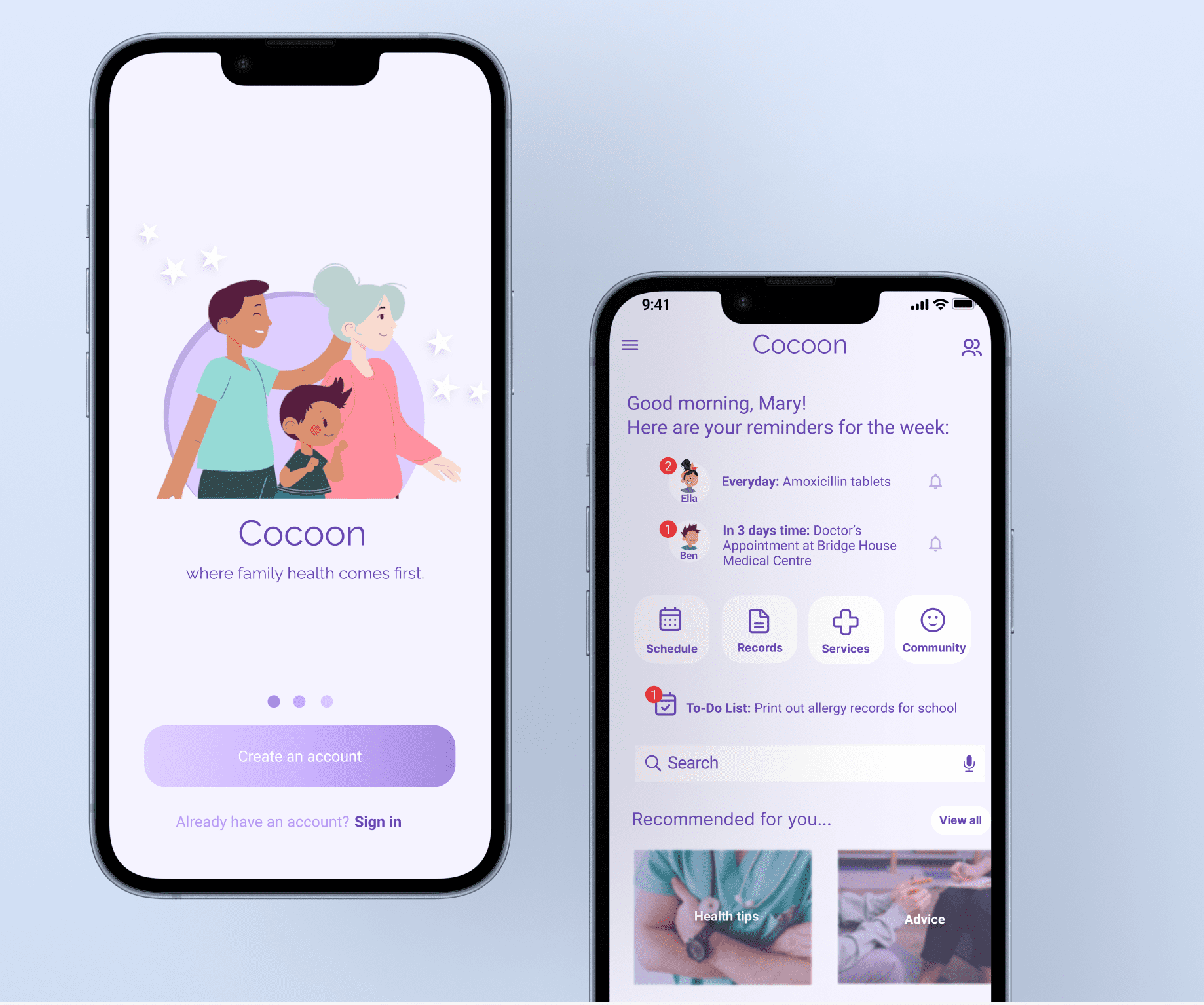
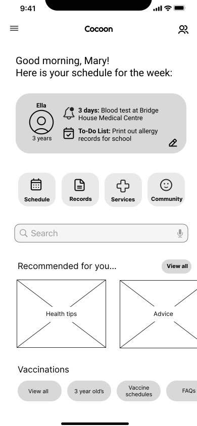
HIGH FIDELITY PROTOTYPES AND MOCKUPS: